We are super excited to announce the unveiling of the new Endless Summer Trail Run Series website! This post probably gets a little more technical and delves into the nuts and bolts of why we designed our site the way we did than the average reader (runner) may be interested in – but besides trail / ultrarunning, web design and user experience is another thing we are very passionate about – so here goes!
Too often I find myself going online to check out a race that I just heard of or click a Facebook link to a race a friend has signed up for only to learn, well… nothing or at least nothing very easily. As a potential participant, when I go to a race website there are a few basic things I am looking learn and hopefully, learn very quickly without having to look too hard.
• Where is the race held (region, state, city)
• When is the race (what time of year and what is the exact calendar date)
• What does the course / race look like (beautiful, ugly, mountainous, flat)
• When does registration open, close and are their field limits etc.
From there, if the prospective race fits the criteria for something I would like to run, I will take the time to dig further into the website and hopefully that website is laid out intuitively.
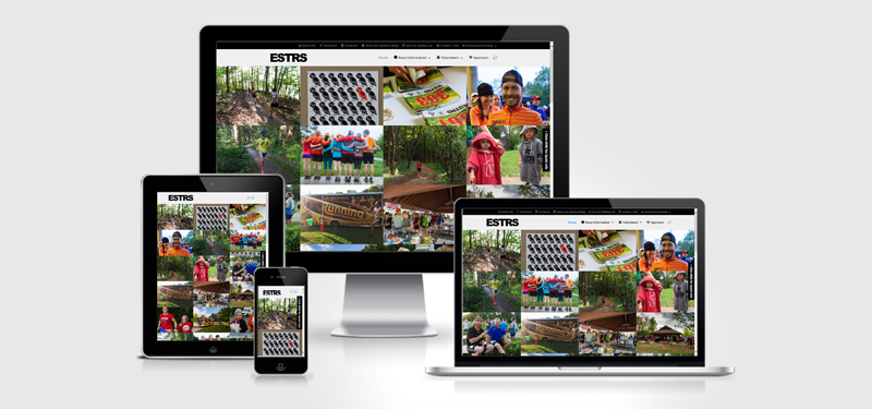
We were determined to give people the best feel possible of what this race is all about and what better way to do as much than with beautiful photography. We have been blessed to have (since the inception of this event) some of the most dedicated and talented volunteer photographers I have ever seen and we really wanted to showcase their work! It is hard to sum any trail / ultra up in words or a single image, so we went for it and sorted through 1000’s of images and came up with a group of awesome photos that we feel represent the race and put them all on the homepage, front and center. With the help of some fancy code that makes it manageable to load this many images without completely bogging down the site, it worked out wonderfully and gives you an immediate feel for the race – like they say, a picture is worth a 1000 words! So while we made the home page of the site very visual we made sure that basic bullet list of items I listed previously can be found quickly and easily and we did this via a couple of strategically placed “Quick-Info” links that activate a nifty “Flyout” slider containing all of the most important information.
From there, we stayed with a similar layout of the old site but grouped most of the key content / pages into “mega-menus” so when you hover over the header “Race Information” for example, a large menu with all of your options appears and you can quickly make a decision about where you want to go. We retooled the sponsors and volunteer sections of the website – as you all know, we would not have an event without volunteers and sponsors and wanted to make sure that volunteering is as painless as possible and that our sponsors get proper recognition!
Well, I could go on but I digress and encourage you to spend some time exploring the site. If there is something that you are looking for and it feels like it took more effort than it should have, please drop us a line. We thank you; runners, volunteers and sponsors for your continued support of our awesome event – we look forward to seeing you this Summer!
Sincerely,
John Storkamp
Race Director
Endless Summer Trail Run Series